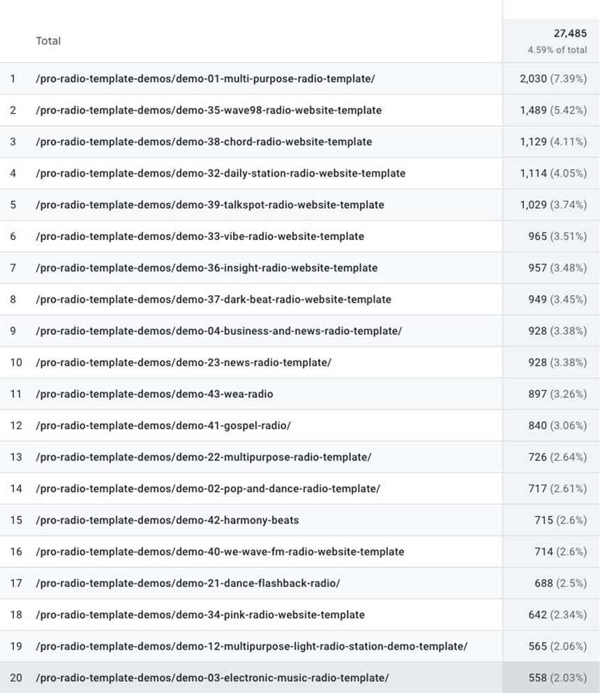
Below you can see a screenshot of the most recent stats and the source data we used.
The Most Loved Radio Station Templates of The Year (and how to find yours)
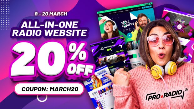
AD
Every month, we publish new Pro Radio demos for all customers. Not “concepts”, not “mockups” — real, installable demo packs you can import in one click and start editing with Elementor.
And because we’re a bit obsessed with what actually works in the wild, we keep an eye on what people visit the most. Those clicks tell a simple story: different radios want different vibes… but some styles just keep winning.
Below you’ll find the Top 20 most visited demos of 2025 (based on page views across the year). A quick note: several of the newest demos (from #35 onward) arrived in the second half of 2025 — and still managed to jump straight into the top spots. That’s a strong signal.
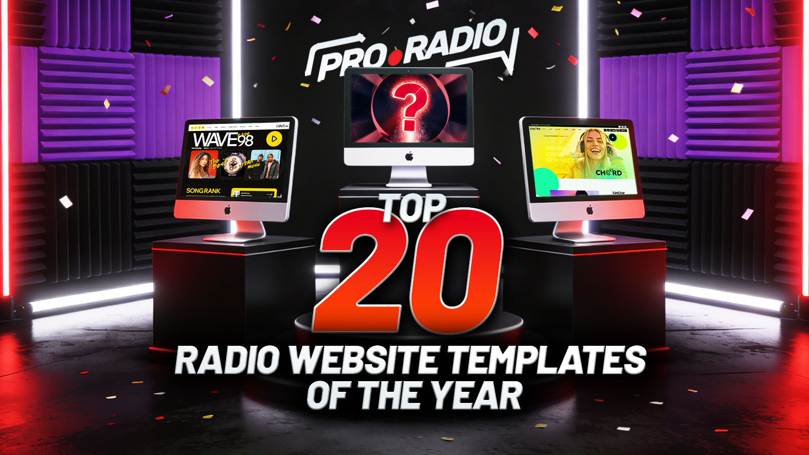
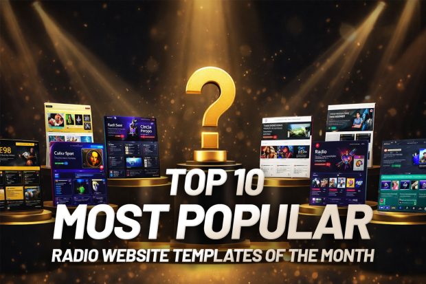
Top 20 Pro Radio Website Templates of 2025
And remember… All demos are included with any Pro Radio theme license!
Contents
hide
- 1. Top 20 Pro Radio Website Templates of 2025
- 2. #1 Demo 01 – Multi-Purpose Radio
- 3. #2 Demo 35 – WAVE98
- 4. #3 Demo 38 – CHORD
- 5. #4 Demo 32 – Daily Station
- 6. #5 Demo 39 – Talkspot
- 7. #6 Demo 33 – Vibe Radio
- 8. #7 Demo 36 – Insight Radio
- 9. #8 Demo 37 – Dark Beat Radio
- 10. #9 Demo 04 – Business & News
- 11. #10 Demo 23 – Radio International (News)
- 12. #11 Demo 43 – WEA Radio
- 13. #12 Demo 41 – Spirit Sound (Gospel)
- 14. #13 Demo 22 – PopTop Radio
- 15. #14 Demo 02 – Pop & Dance
- 16. #15 Demo 42 – Harmony Beats
- 17. #16 Demo 40 – We Wave FM
- 18. #17 Demo 21 – Dance Flashback (90’s)
- 19. #18 Demo 34 – Pink Radio
- 20. #19 Demo 12 – Sun City Radio
- 21. #20 Demo 03 – Electronic Music
- 22. How to pick “the one” (without overthinking it)
- 23. Try them all — they’re included
- 24. The latest stats on our most popular radio website templates
- 25. Go explore the full demo library
#1 Demo 01 – Multi-Purpose Radio
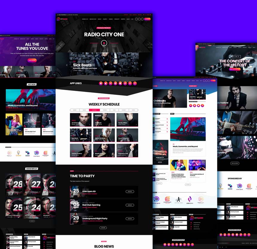
This is the original concept behind the Pro Radio WordPress Theme. Even with 40+ newer demos released since then (and plenty of fresh templates pushing it down the list), it still remains the #1 pick for our users. Maybe it’s the simplicity, or maybe it’s the fact it comes with 20 Elementor homepage templates — either way, this little gem keeps capturing the hearts of radio station owners everywhere.
- Best for: stations that want a clean, do-it-all starting point (music, community, mixed content).
- Vibe & colors: a balanced “classic Pro Radio” look — easy to brand, easy to reshape into your style.
- Homepage 01 highlights: live player front and center, show schedule blocks, featured content areas (news/podcasts/events) ready to swap with your own.
#2 Demo 35 – WAVE98
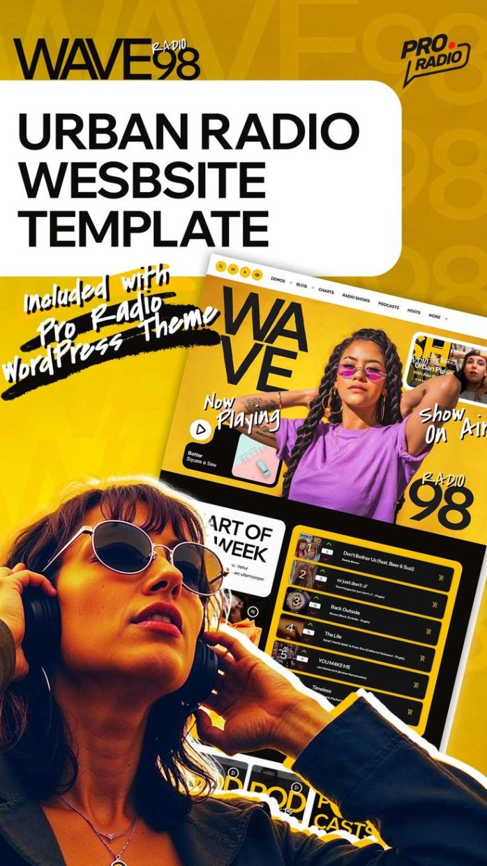
I must admit: lately, most of our customers’ websites are built on this demo. Its unique, powerful color combination works beautifully for almost any station. White, black, and yellow — no joke — it’s pure energy for a radio station website.
- Best for: energetic commercial stations, pop/urban formats, modern “big city” brands.
- Vibe & colors: bold and punchy — designed to feel fast, loud, and fresh.
- Homepage 01 highlights: hero “listen live” area, featured shows, chart/playlist sections, and strong call-to-action zones for community growth.
#3 Demo 38 – CHORD
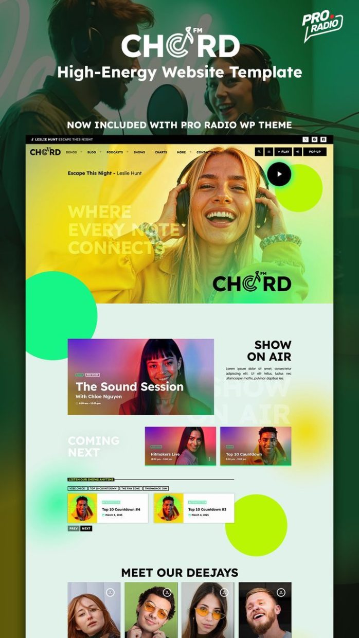
Extremely modern and colorful, yet gentle and sleek, this demo has a truly unique design language that adapts easily to a wide range of broadcasting niches — from pop and news to community and gospel stations. The palette isn’t as punchy as some of the others, but that’s exactly the point: its elegance makes it a perfect choice for radios that want to stand out with style, not noise.
- Best for: music-first stations that want a sleek, modern stage for tracks, shows, and charts.
- Vibe & colors: contemporary and high-contrast — built to make album art and show visuals pop.
- Homepage 01 highlights: “now playing” focus, music discovery blocks, charts/featured tracks, plus clear show promotion sections.
#4 Demo 32 – Daily Station
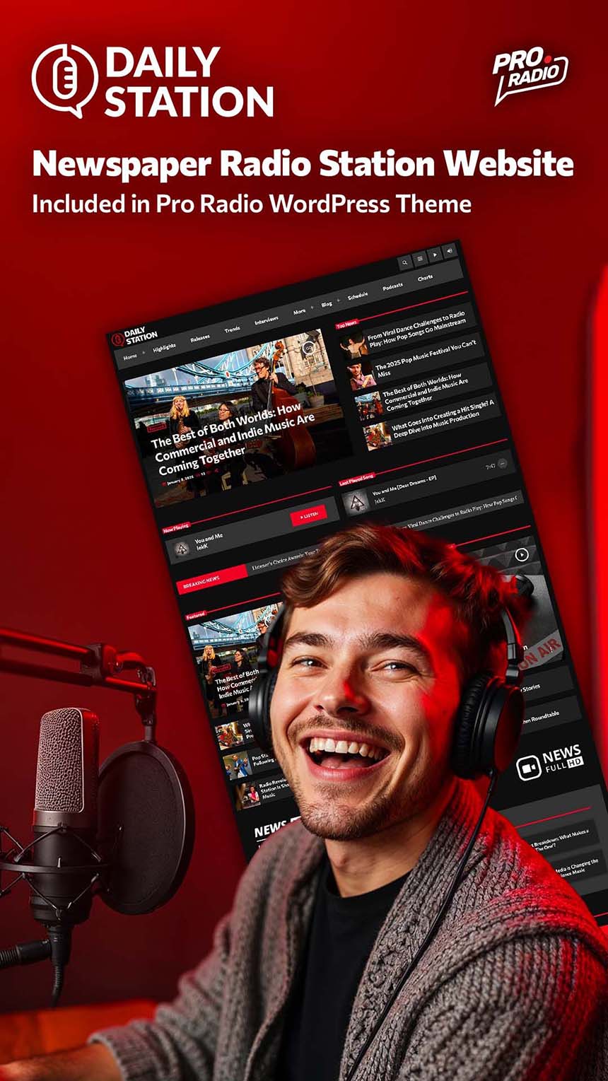
Extremely simple and fully magazine-oriented, this template is a must if you want a quick-loading, highly scannable homepage. Sharp edges and a dark, night-friendly style make it perfect for long reads after hours. If your station is news-based, Pro Radio Demo 32 – Daily Station is a strong choice. It includes multiple homepages and fits perfectly for a multi-category radio that mixes blog posts, charts, podcasts, and advertising.
- Best for: talk, magazine, news + music hybrids, stations that publish often.
- Vibe & colors: editorial-friendly — structured layouts that keep content readable and organized.
- Homepage 01 highlights: latest posts/news modules, featured programs, schedule previews, and fast paths to podcasts/on-demand content.
#5 Demo 39 – Talkspot
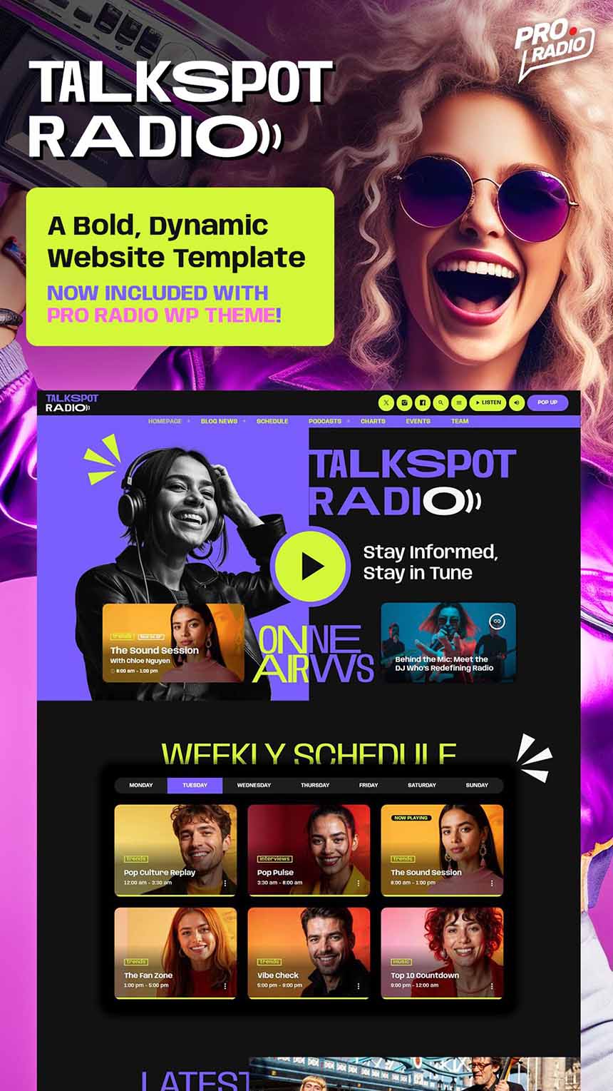
Negative colors and a bold palette, with a strong presence of purple and powerful sparks of acid green: when having a strong identity isn’t optional, Pro Radio Demo 39 – Talkspot is a choice with no equals. On top of that, the three included Elementor homepages are neat and effective, packing the essentials every station needs — a big player, show schedule, songs, and podcasts. When content comes first, this demo delivers exactly what you need.
- Best for: talk radio, interviews, podcasts, personalities, commentary-driven stations.
- Vibe & colors: confident and direct — built to spotlight voices, guests, and topics.
- Homepage 01 highlights: featured show panels, podcast sections, schedule teasers, and “latest episodes” style content blocks.
#6 Demo 33 – Vibe Radio
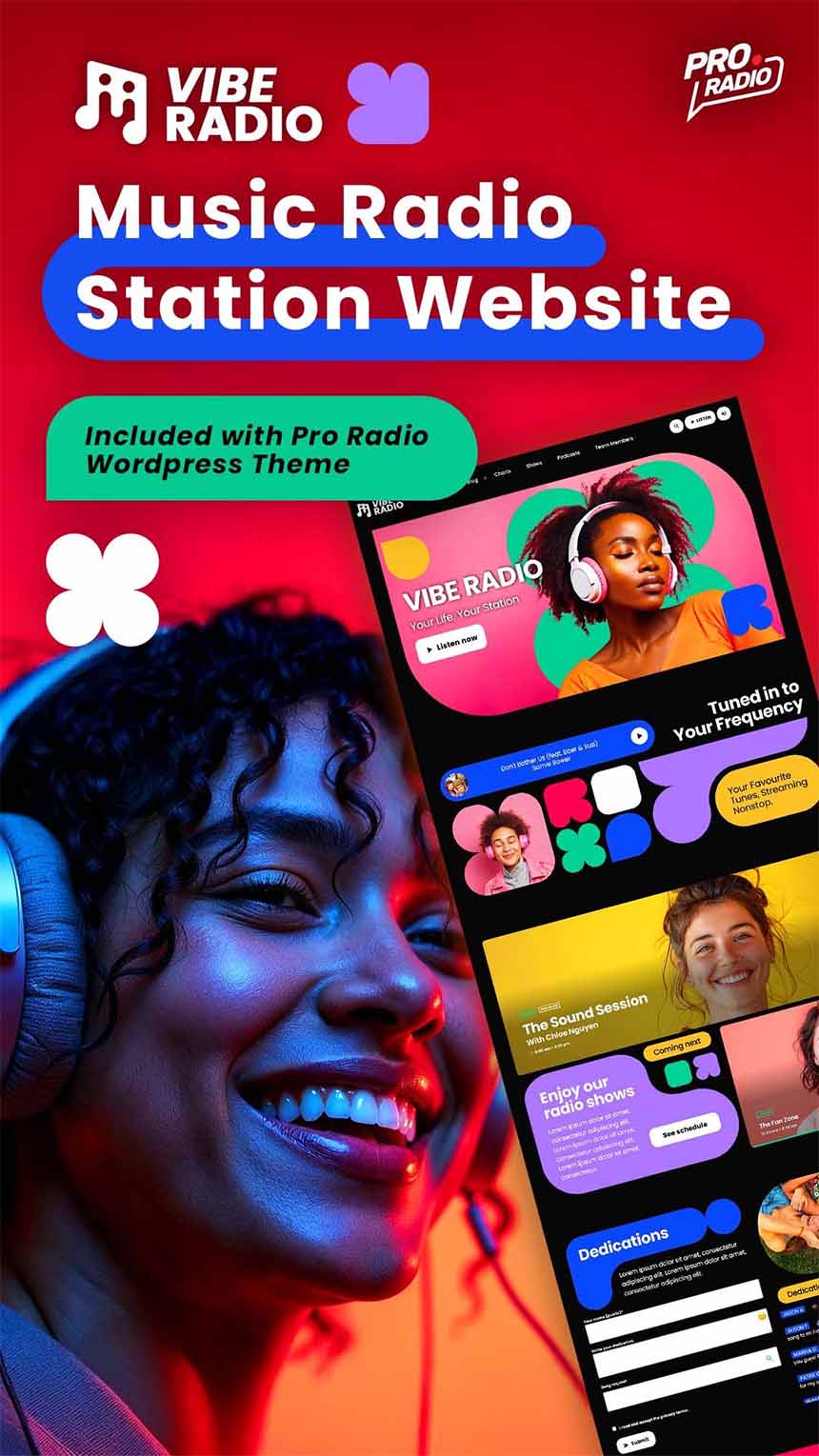
A quick look at this amazing demo can instantly lift your mood and pull you into a positive vibe: cheerful, eclectic, and super original. Pro Radio Demo 33 – Vibe Radio is a true joy for the eyes, blending curves and shapes in a way few radio templates can match. And even with all that personality, it’s still easy to edit and packed with every feature you need. Music-first and youth-oriented, it’s another standout favorite among our customers.
- Best for: pop, chart stations, youth-oriented brands, “we’re not boring” radios.
- Vibe & colors: geometric, vivid, high-energy — a dark background that makes saturated colors shine.
- Homepage 01 highlights: big visual entry, charts/showcase blocks, featured shows, and content sections designed for constant interaction.
#7 Demo 36 – Insight Radio
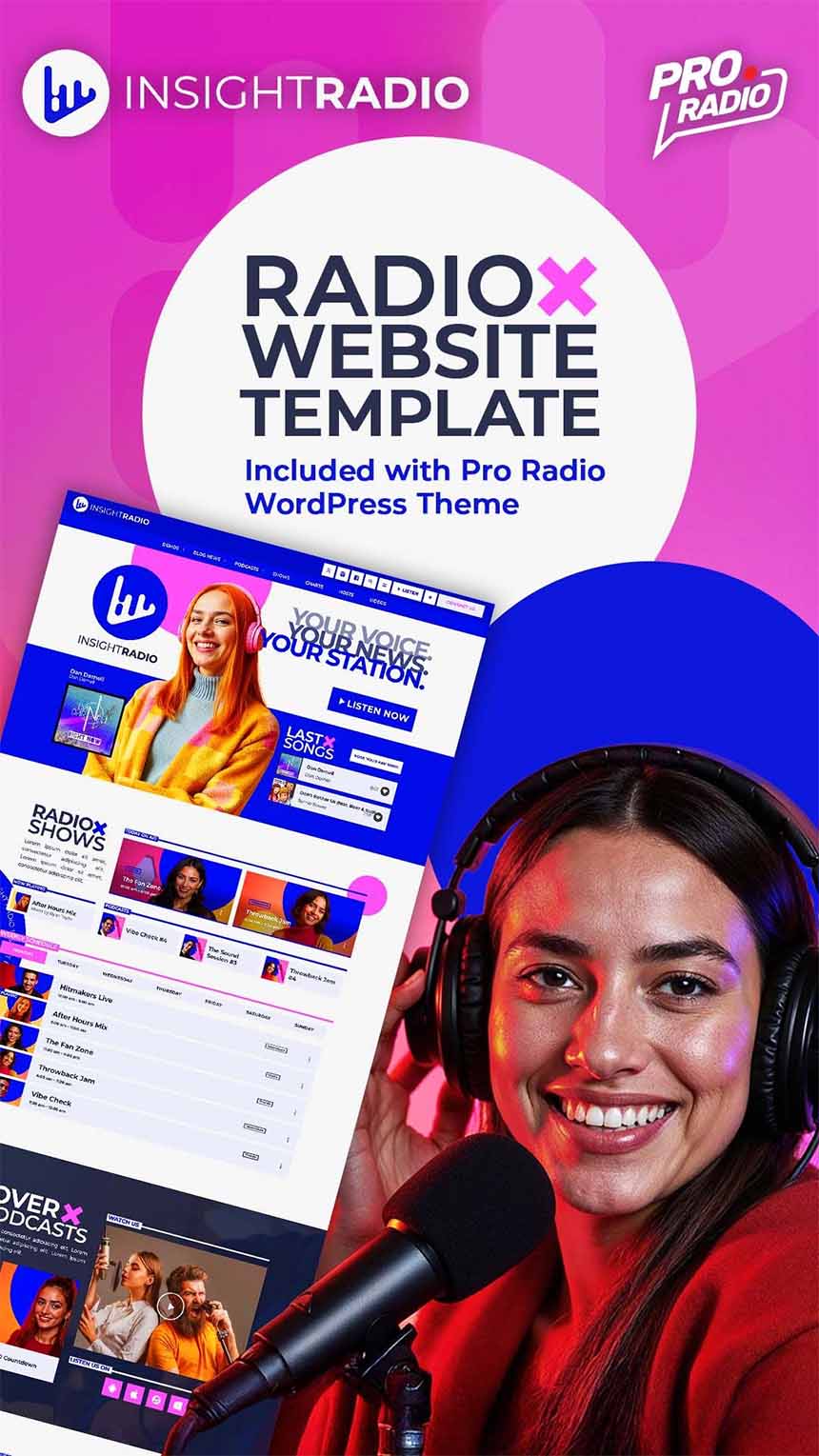
Simple, neat, light, and professional. If you want to highlight the quality of your content and your speakers, this demo is a perfect fit. Pro Radio Demo 36 – Insight Radio gives you plenty of options to communicate professionalism and ease of use, while still feeling engaging and entertaining. With its bright blue and pink accents, it delivers an elegant tone without ever becoming boring. Perfect for podcast-centered radio stations.
- Best for: talk shows & podcasts with a modern, polished feel.
- Vibe & colors: minimalist and elegant, with cobalt/blue tones and subtle accent pops.
- Homepage 01 highlights: podcast-forward layout, series browsing feel, strong episode discovery zones, and a clean structure that reads beautifully on mobile.
#8 Demo 37 – Dark Beat Radio
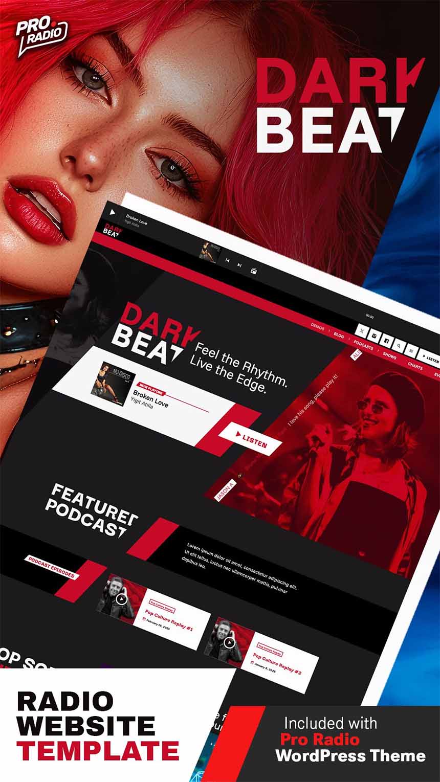
Dark background, stylish diagonal cuts, bold shapes and masks, and an undeniable feeling of technology and attitude. This is probably the most popular demo among the newest entries.
Homepage 1 opens with a sleek player and a clean, content-first layout featuring podcasts and a full schedule timetable. Homepage 2 goes all-in on music, showcasing Pro Radio Sidekick playlists to highlight your top tracks, with options for visitors to listen and vote. Homepage 3 is the boldest one: futuristic shapes, cropped imagery, and a striking layout that blends a custom player with popular songs, upcoming shows, and the programming schedule.
Perfect for electronic music, rock, and any station that wants to leave a mark on first click.
- Best for: electronic, techno, rock, high-impact music brands.
- Vibe & colors: deep black + intense red contrast — bold, club-ready, zero compromise.
- Homepage 01 highlights: live player presence, show promotion blocks, podcast/on-demand zones, and dynamic sections made for fast scrolling and instant clicks.
#9 Demo 04 – Business & News
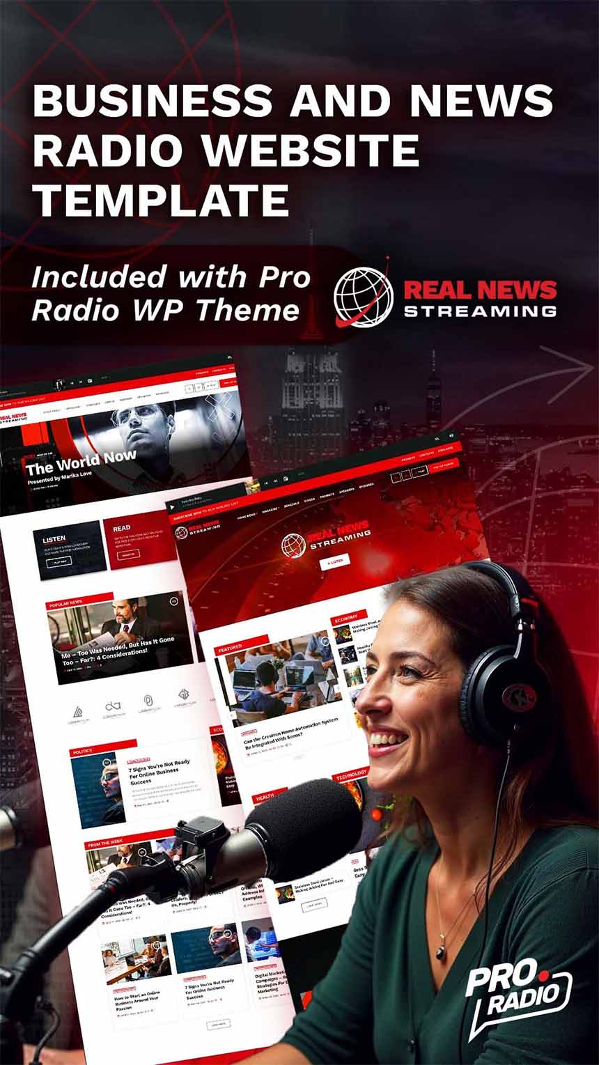
A true classic. This demo uses one of the most loved color combinations — red, black, and white — blending a powerful, bold identity with a magazine-first homepage layout.
- Best for: business radio, finance shows, news networks, “professional broadcast” positioning.
- Vibe & colors: corporate-clean and content-heavy — designed to look credible and structured.
- Homepage 01 highlights: multiple homepage layouts available, plus modules for shows, events, podcasts, and magazine-style content.
#10 Demo 23 – Radio International (News)
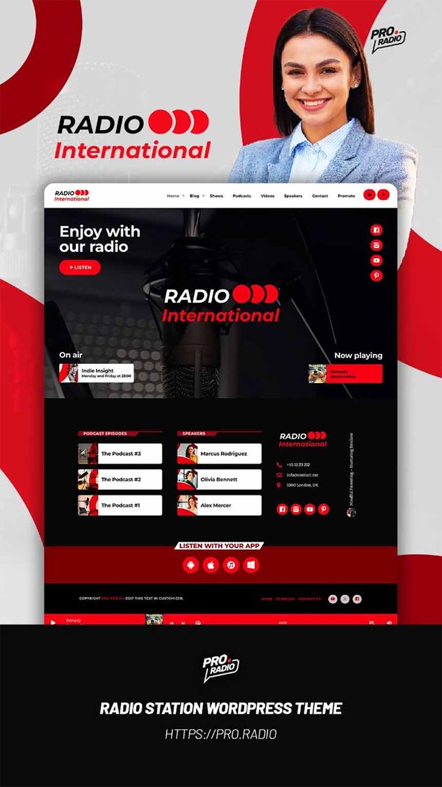
- Best for: news radio that wants a premium, newsroom feel.
- Vibe & colors: black & white elegance with red accents — clean, minimalist, professional.
- Homepage 01 highlights: editorial blocks, strong navigation, show/podcast areas, and content-first layout built to avoid clutter.
#11 Demo 43 – WEA Radio
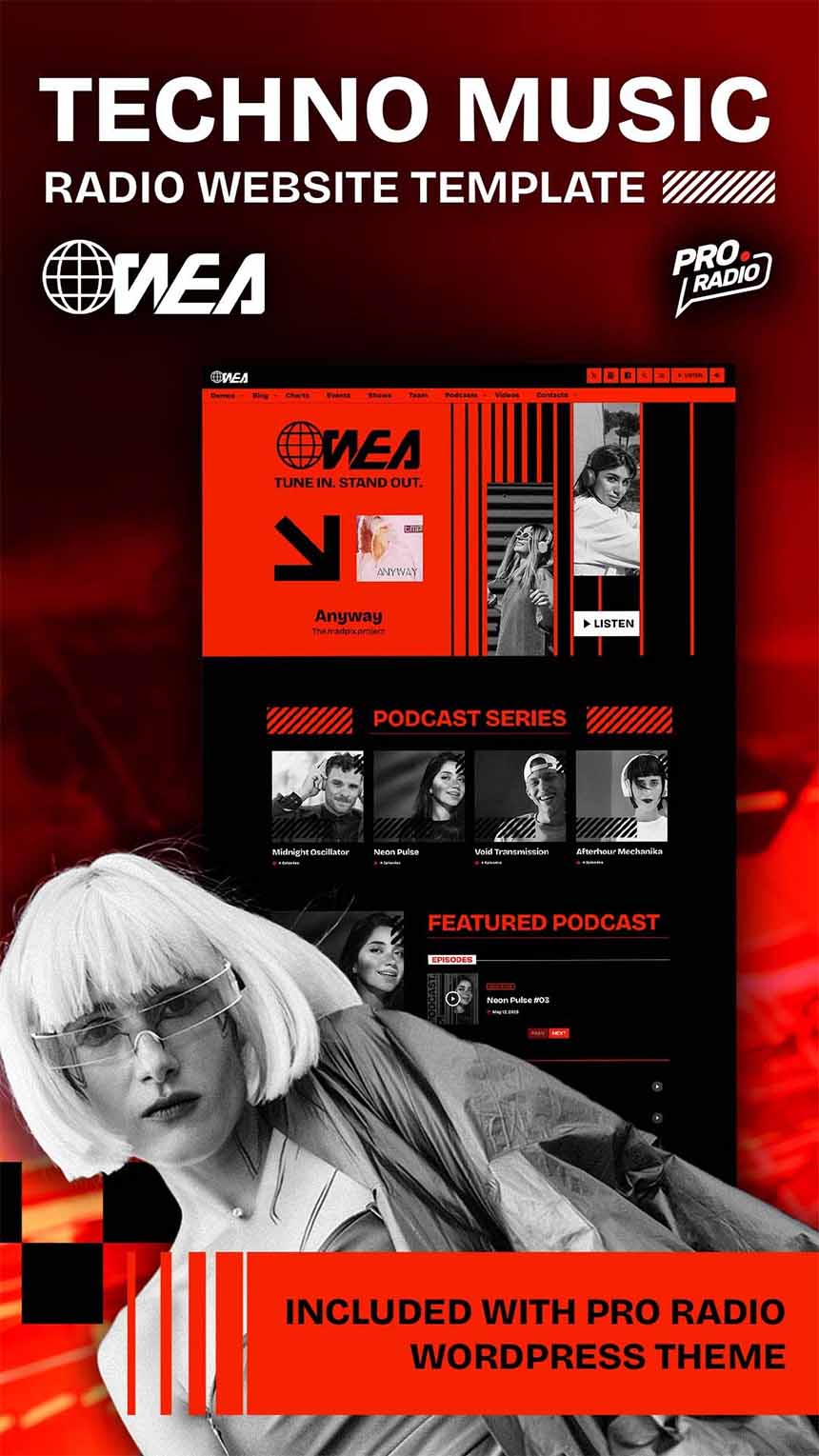
- Best for: underground techno, warehouse vibes, EDM collectives, DJ communities.
- Vibe & colors: brutalist, raw, red/black, monochrome imagery — looks like a rave poster in website form.
- Homepage 01 highlights: live player, show cards, events built for nights and festivals, plus chart areas perfect for rotation and label promotion.
#12 Demo 41 – Spirit Sound (Gospel)
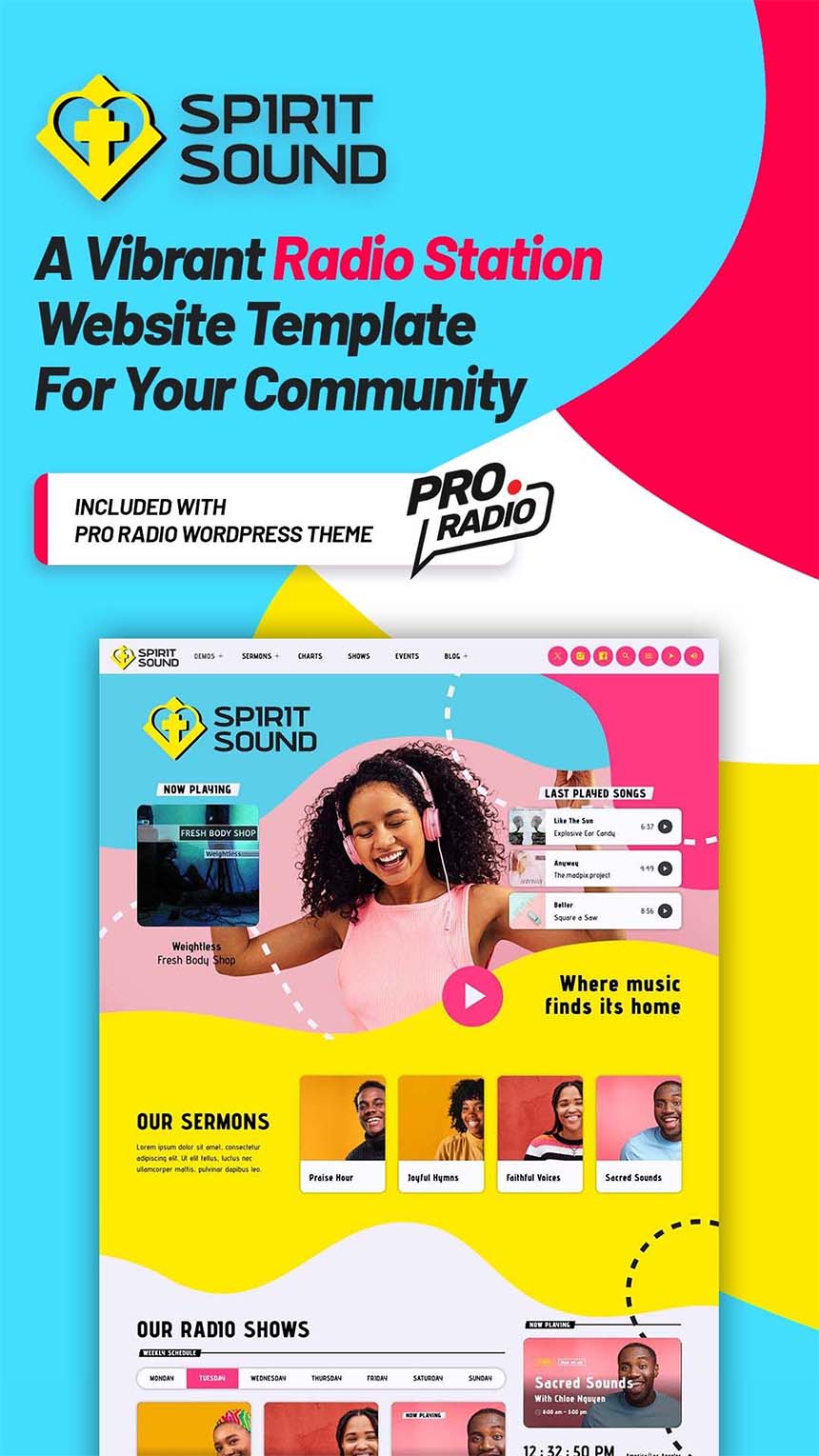
- Best for: gospel stations, faith-based radios, inspirational podcasts, community networks.
- Vibe & colors: bright, joyful accents with warm energy — designed to feel welcoming.
- Homepage 01 highlights: live player, schedules/events/on-demand sections, WooCommerce-ready spaces for merch/tickets, and a lovely Live Clock widget touch.
#13 Demo 22 – PopTop Radio
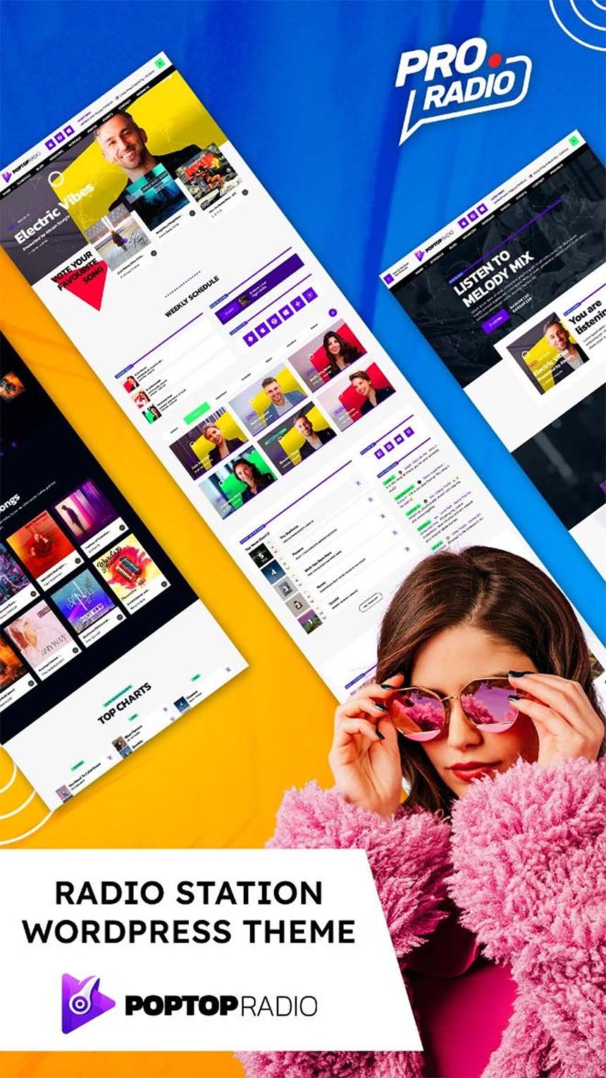
- Best for: pop, dance, EDM, commercial radios that want something lively but flexible.
- Vibe & colors: electric, irregular shapes, vivid color movement — playful without becoming chaotic.
- Homepage 01 highlights: strong hero entry, content blocks designed for shows and charts, and a layout that pairs perfectly with Sidekick content modules.
#14 Demo 02 – Pop & Dance
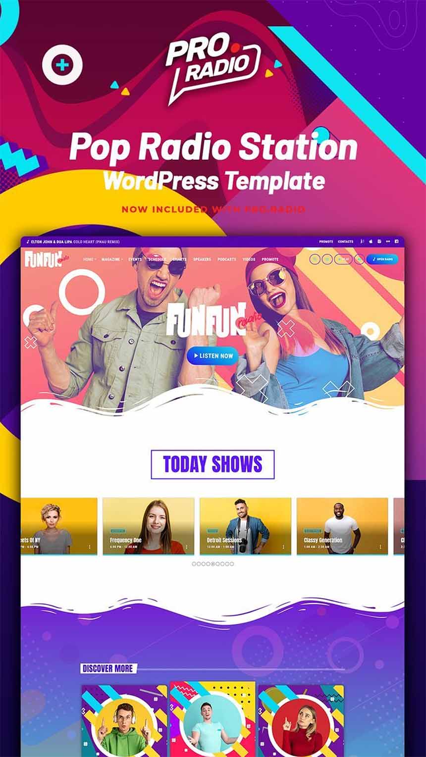
- Best for: energetic mainstream radios that want maximum “party” on first impression.
- Vibe & colors: unapologetically colorful and young — built to feel alive.
- Homepage 01 highlights: multiple homepage layouts available, with radio essentials ready: shows, schedule, events, news, videos, DJs and more.
#15 Demo 42 – Harmony Beats
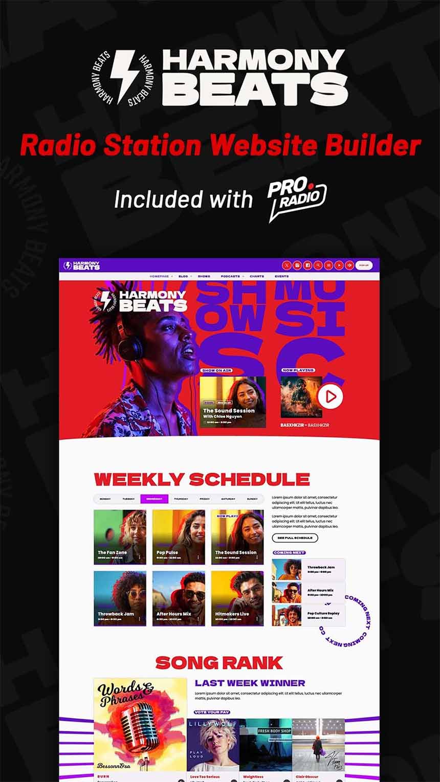
- Best for: hip-hop, rap, reggaeton, urban, trend-driven stations.
- Vibe & colors: high-impact red/purple gradients, bold typography, modern “big headline” energy.
- Homepage 01 highlights: live stream area with “now playing”, schedule grid, countdown modules, charts sliders, podcast sections, events with ticket CTAs, and team cards.
#16 Demo 40 – We Wave FM
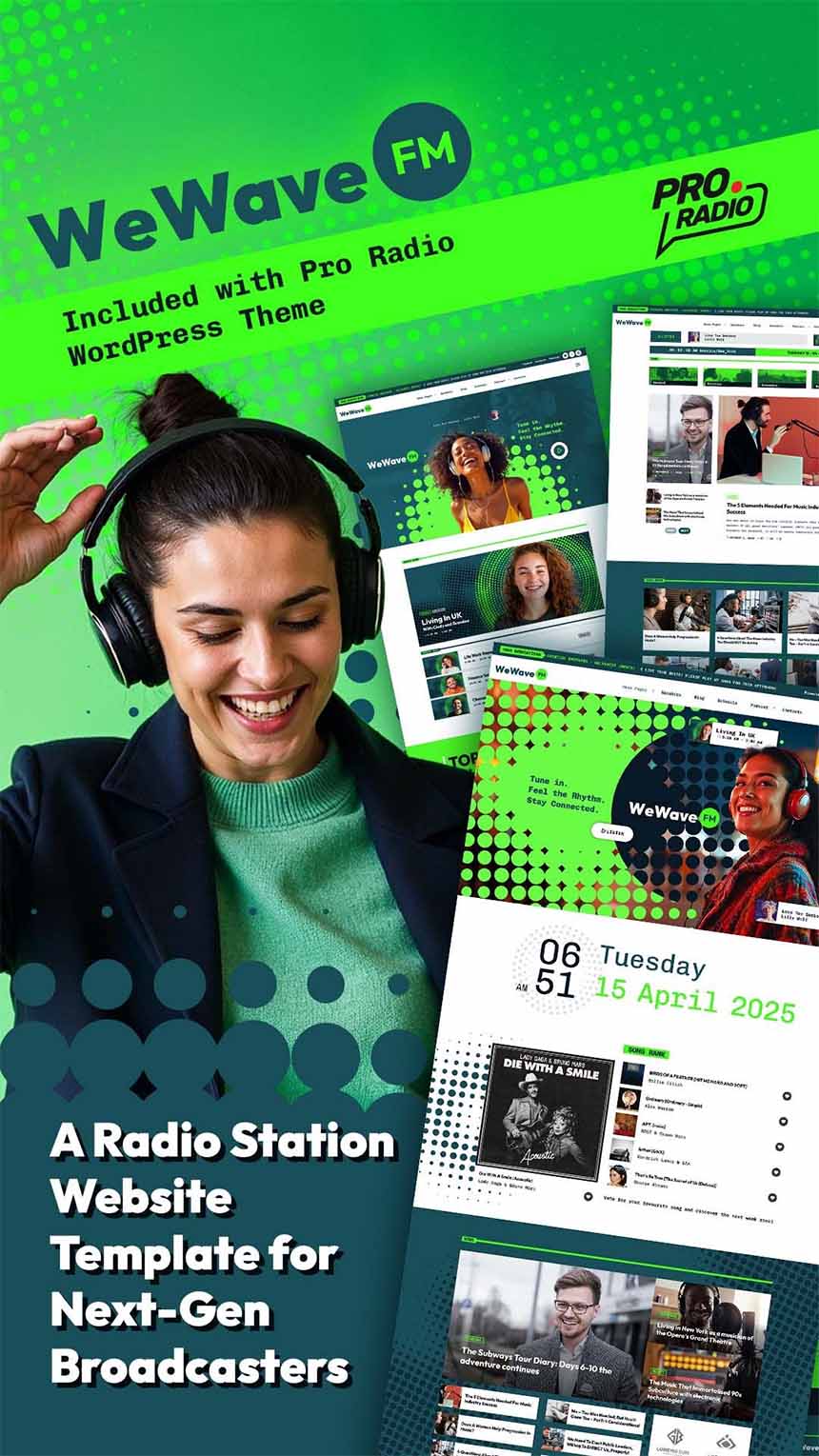
- Best for: stations that want a fresh reboot: talk, DJs, podcasts, indie networks.
- Vibe & colors: crisp green palette with playful halftone/popfresh decorations — clean, but not shy.
- Homepage 01 highlights: non-stop player bar, featured shows, music charts, podcast/on-demand blocks, plus news/interview modules with bold typography.
#17 Demo 21 – Dance Flashback (90’s)
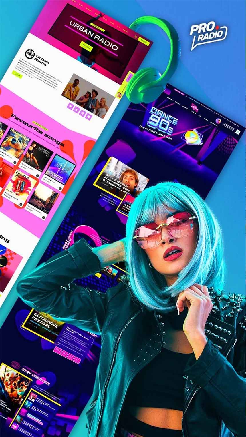
- Best for: 90’s dance, progressive, retro nights, nostalgia-driven stations.
- Vibe & colors: magenta and purple depth with cyan/yellow sparks — it feels like stepping into a 90’s dance floor.
- Homepage 01 highlights: immersive hero sections, show promotion blocks, and parallax-driven sections designed for that “movement” feeling while scrolling.
#18 Demo 34 – Pink Radio
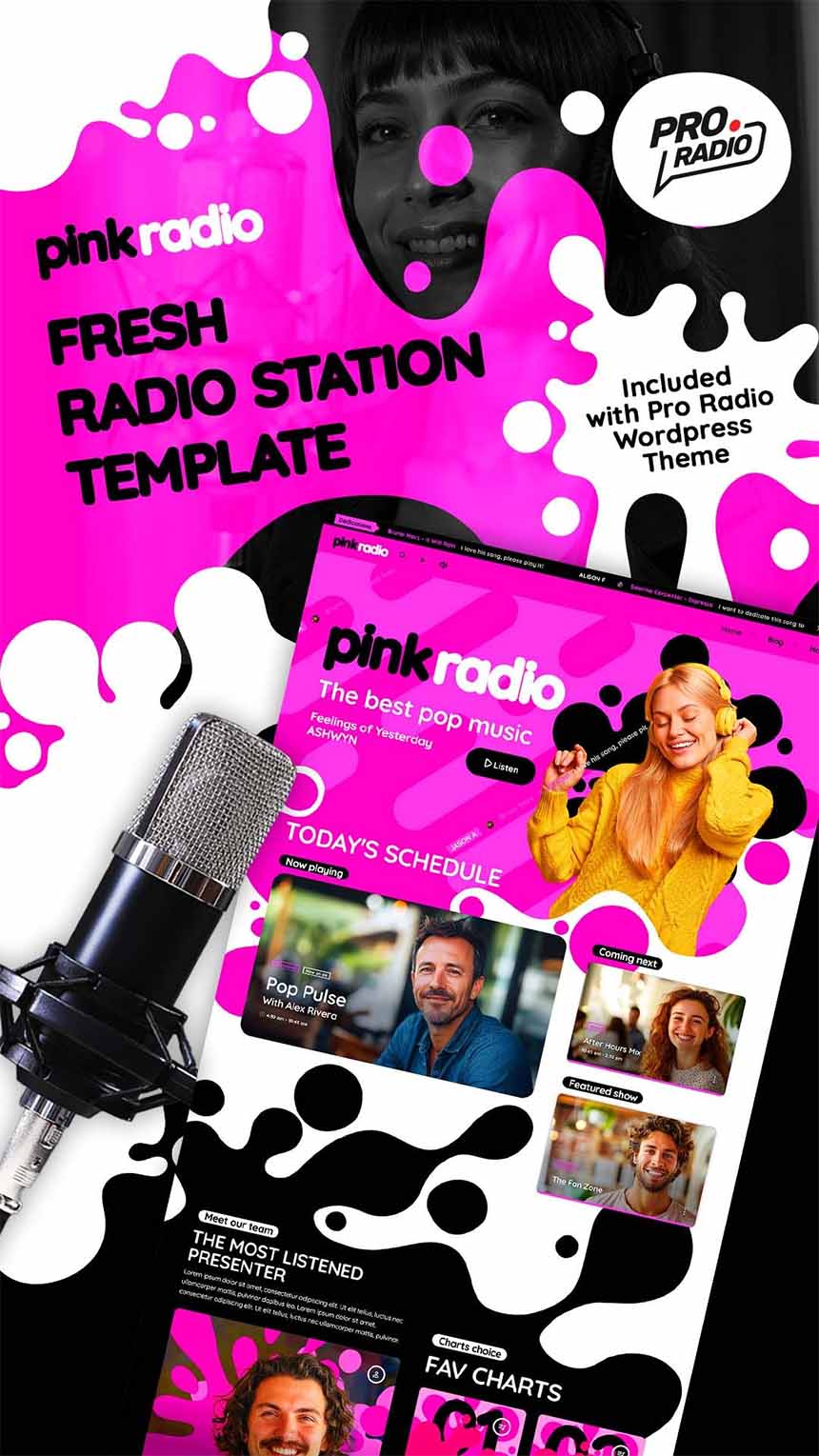
- Best for: bold personalities, creative stations, brands that want to be instantly recognizable.
- Vibe & colors: organic/fluid shapes, pink/black/white punch — playful and brave.
- Homepage 01 highlights: streaming focus, schedule visibility, podcast/on-demand readiness, plus a structure that makes your station’s identity feel “designed”, not generic.
#19 Demo 12 – Sun City Radio
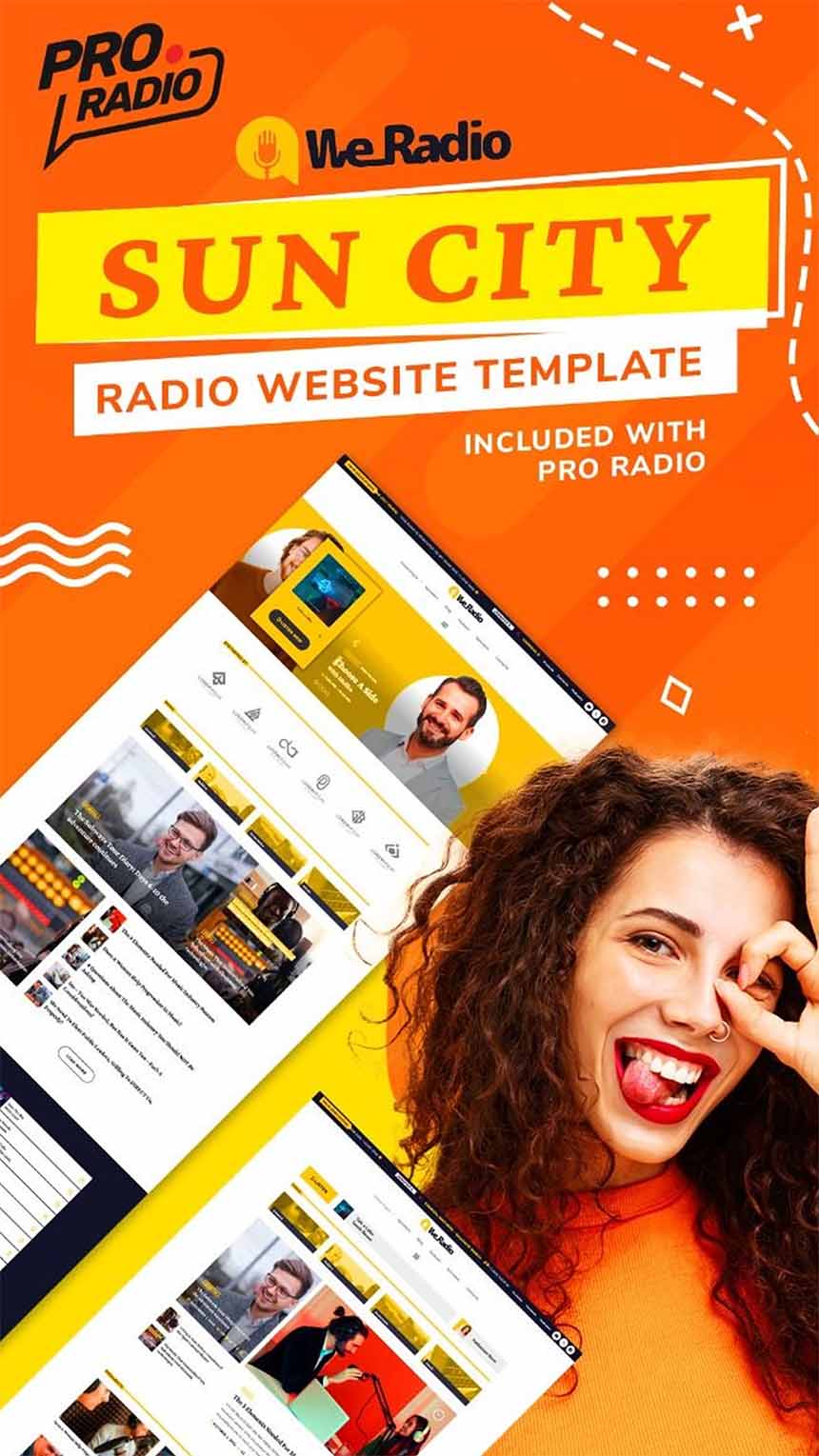
- Best for: local/community radios, classic stations, content-rich sites that want calm clarity.
- Vibe & colors: lightweight, neat, simple and clean — a “friendly morning show” kind of vibe.
- Homepage 01 highlights: blog/news modules, schedule and podcast areas, and multiple homepage options that are easy to adapt without heavy redesign.
#20 Demo 03 – Electronic Music
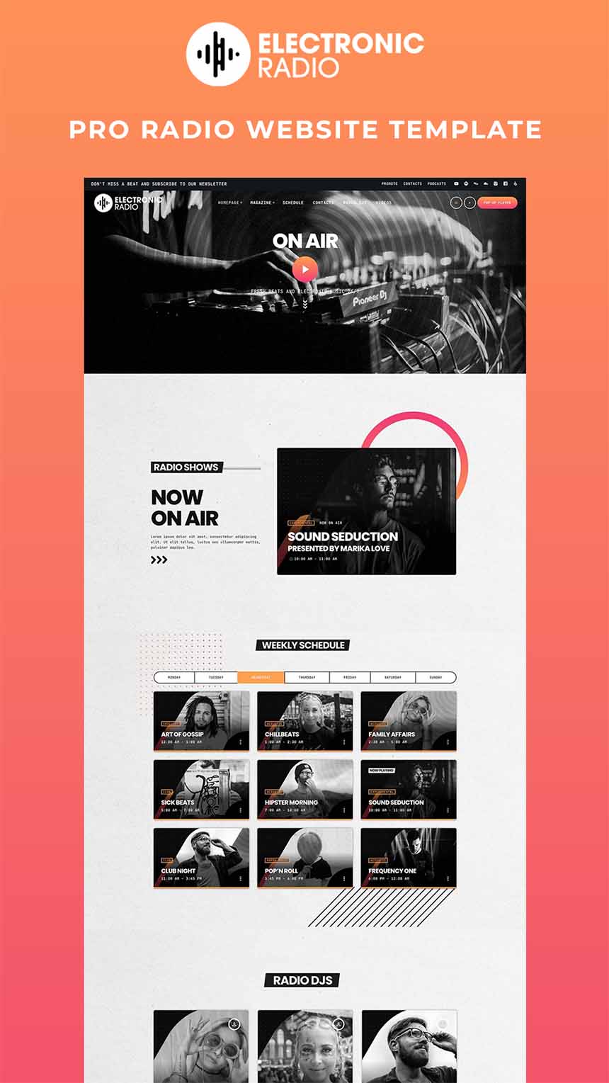
- Best for: electro, drum’n’bass, techno, underground stations.
- Vibe & colors: stylish and club-ready — built to showcase mixes, shows, and movement.
- Homepage 01 highlights: custom players, schedule, podcasts, charts, events, and news blocks — a full electronic station toolkit on the front page.
How to pick “the one” (without overthinking it)
If you’re reading this and thinking “they’re all cool… now what?”, try this:
- If your radio is news / talk / podcasts: start with Radio International, Talkspot, or Insight.
- If your radio is pop / charts / commercial: go straight to WAVE98, Vibe, or PopTop.
- If your radio is electronic / underground: open WEA, Dark Beat, or Electronic Music.
- If your radio is community / versatile / mixed: Demo 01 and Sun City are great “build-from-here” bases.
- If your brand is pure personality: Pink Radio is a statement.
Try them all — they’re included
Every single demo above is included with Pro Radio.
After installation, you can choose the demo that matches your vibe, import it in one click, and start shaping it into your station.
And if you change your mind later (it happens): you can reset your website and install a different demo and switch the look whenever you want. No extra cost!
The latest stats on our most popular radio website templates
Go explore the full demo library
AD
You may also like
Copyright 2019-2026 ProRadio® Qantum Themes SL® All Rights Reserved