


Stop Sending Listeners To An Ugly Radio Site
AD
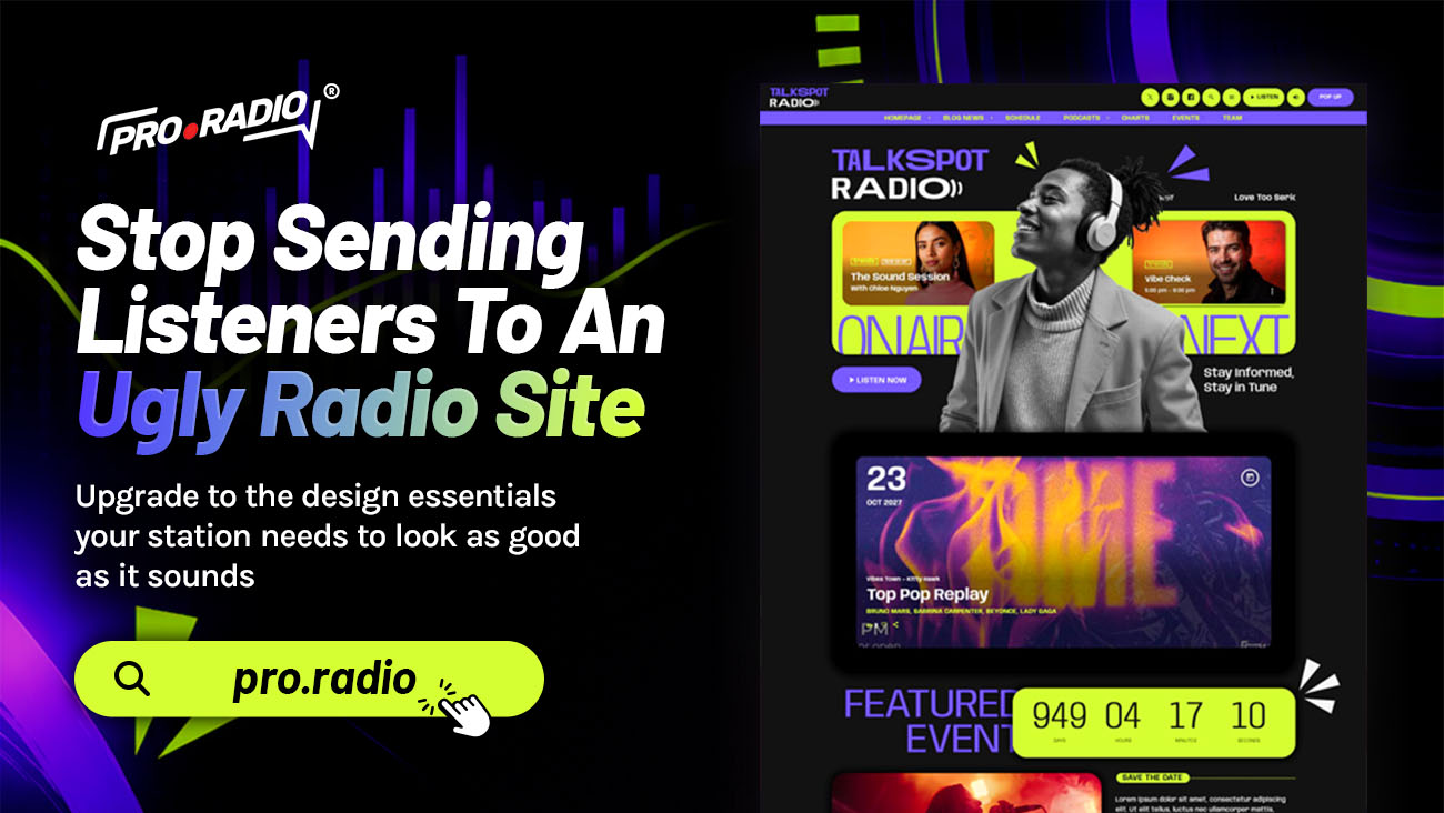
Upgrade to the design essentials your station needs to look as good as it sounds. You spend hours selecting the right playlist, you polish jingles, you train hosts. Then a listener finds the website and sees a 2012 theme with a tiny logo, an awkward color clash, and a homepage that says “Welcome to our radio.” That mismatch is doing real damage.
This is not about chasing trends. It is about looking like the station you already are.
Contents
hide
- 1. The Visual Gap Between Your Sound And Your Site
- 2. The Customizer That Doesn’t Need A Developer
- 3. Header, Menu, And Player Treated As One Brand
- 4. Elementor For The Parts That Make You Different
- 5. Why Pretty Matters For Sponsors
- 6. Practical Use Cases For A Visual Upgrade
- 7. One Toolkit Is Better Than A Pile Of Plugins
- 8. Stop Apologizing For The Site
The Visual Gap Between Your Sound And Your Site
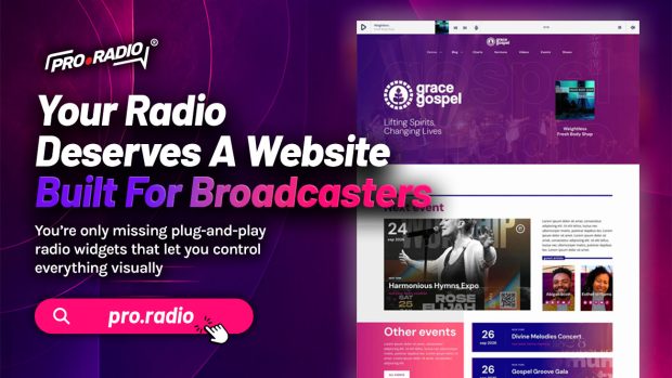
There is a strange habit in broadcasting. Stations care deeply about audio quality, then accept a website that looks like a free WordPress blog template from a decade ago. The result is a visual gap. Visitors hear something professional, then look at something amateur. They feel a small confusion, then look for a more confident-looking station.
Design is not decoration. It is the first impression of your brand. A new visitor decides in seconds whether you are a real station or a hobby experiment. If the homepage looks generic, the playlist behind it is judged the same way.
The good news is that you do not need a designer to fix this. You need a system designed for radio that gives you the right defaults from the start, then lets you adjust the details.
The Customizer That Doesn’t Need A Developer
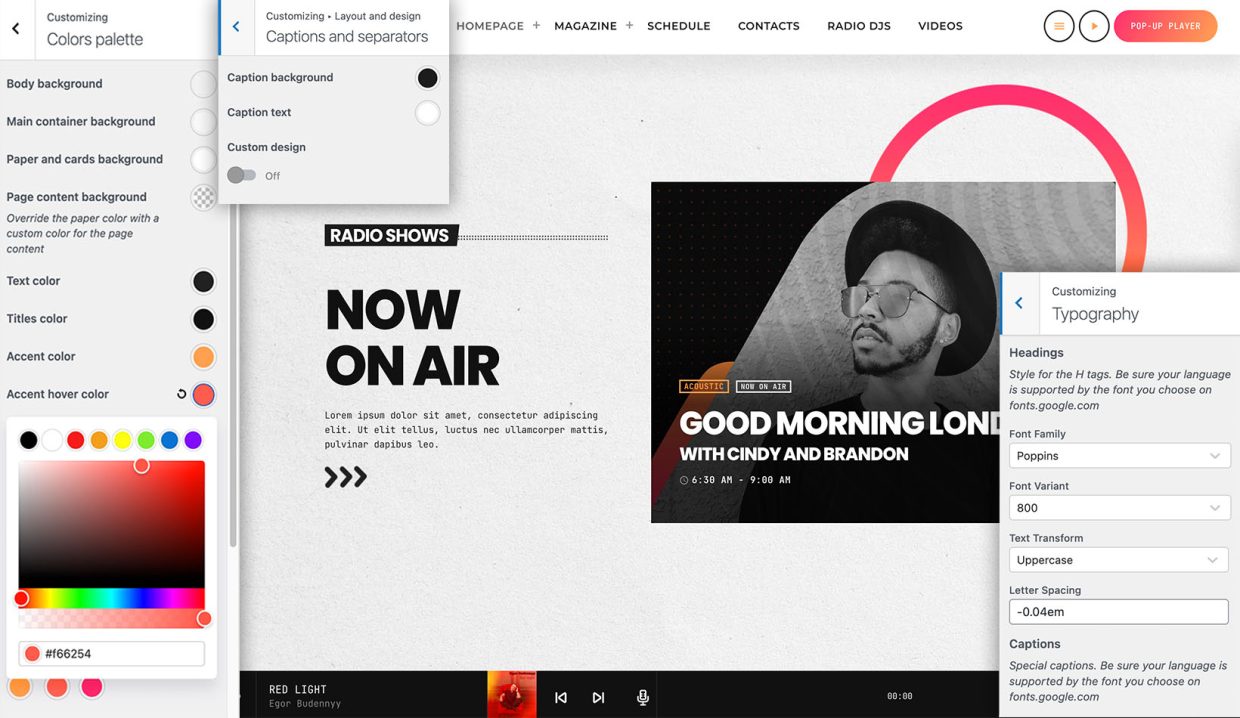
Pro Radio includes a deep customizer with more than two hundred options in the standard version, and over two hundred and sixty in the all-in-one hosted setup. That sounds like a lot until you realize what it covers.
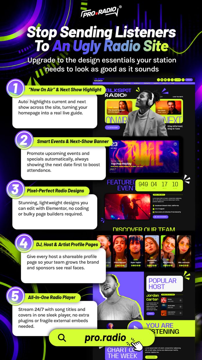
You can change menu, button, footer, and player colors with material-design-based palettes. You can adjust typography for body content, bold text, headings, and captions independently. You can choose from four menu locations and two sidebar positions. You can pick from a hundred call-to-action icons and a hundred secondary menu icons. You can decide whether your page headers use parallax, waves, duotone, grayscale, or gradient effects.
This is not a list of toys. Each of these controls is the difference between a website that looks like every other WordPress blog and one that feels distinctly like your station. And every setting is in one customizer, with a live preview, so you can see changes before you commit.
Generic themes treat the header, the navigation, and the player as three separate pieces of furniture. That is why so many radio sites look stitched together.
Pro Radio handles them as one brand experience. You can use a sticky or transparent menu so the player and navigation feel integrated. You can place the player in the header or footer for large screens, so it is always visible without dominating the page. You can show the cover of the current show inside the player. You can choose a different mobile logo and mobile call-to-action treatment so the small-screen version of your site still feels intentional.
The result is a site that looks composed. Listeners do not consciously notice these details. They simply feel that your station looks confident.
Elementor For The Parts That Make You Different
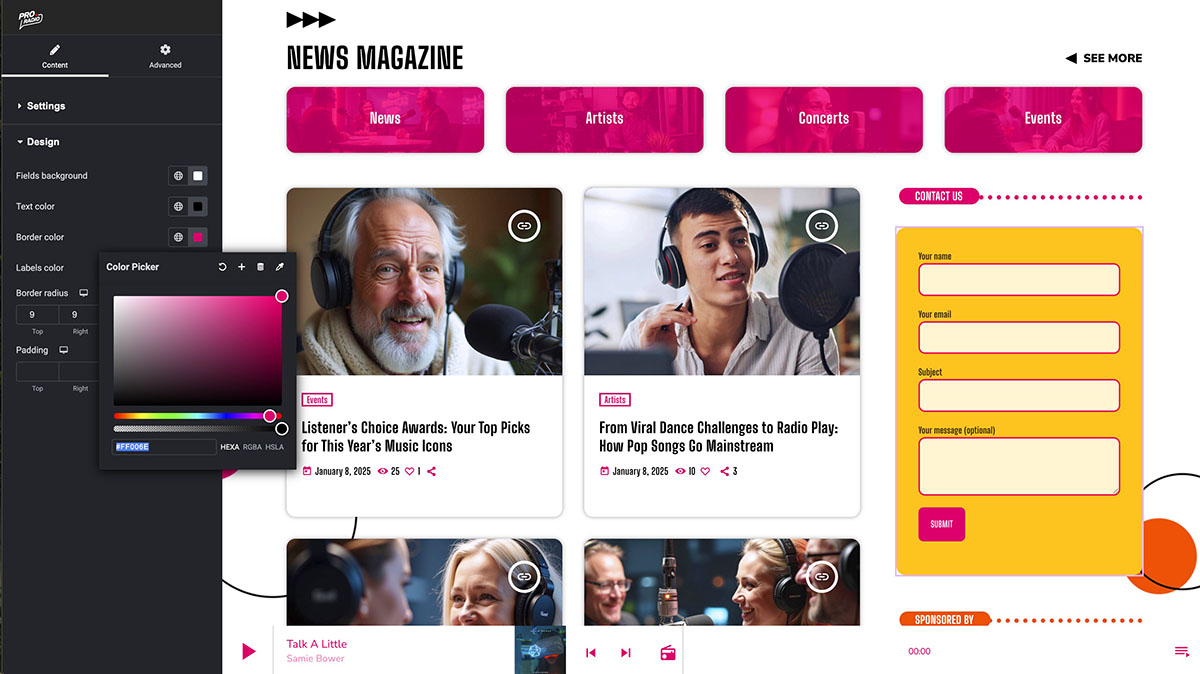
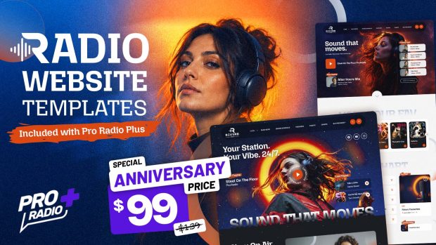
The customizer handles the global look. Elementor handles the parts that make each station different. Pro Radio comes with deep Elementor integration, more than thirty custom radio widgets, and over eighty ready-to-use templates. The hosted Plus plan adds well over three hundred Elementor templates so you can build pages around shows, charts, podcasts, events, or sponsors without starting from scratch.
Need a homepage hero that shows the live show right now, the upcoming carousel, and a play button stacked over a brand image? Drag and drop. Want a show landing page with a custom track chart and a recent podcast list? Same. Need a sponsor page with a call to action and a contact form? It is already a template.
The point is not to learn a new tool. The point is to control your site visually, without waiting on a developer for every small change.
Why Pretty Matters For Sponsors
The financial side of radio is also visual. Local businesses, community partners, and ad buyers look at your website before they sign anything. If your site looks weak, they push back on rates. If it looks strong, they listen.
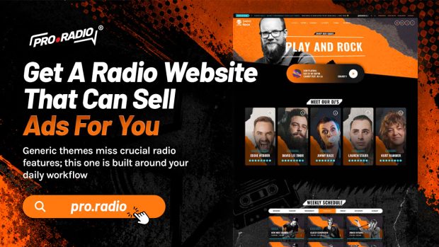
Pro Radio includes layouts that make sponsors visible without making the site look like a billboard. With the Business Tools ad manager addon, you can place rotating banner positions through Elementor widgets, mix AdSense and affiliate codes with direct sponsor campaigns, and provide each sponsor with an automatically generated statistics page. The sponsor signs the deal, sees real-time click data, and treats your station seriously.
That entire revenue conversation starts with the look of your site. An ugly radio site does not get premium ad rates. A clean, modern one does.
Practical Use Cases For A Visual Upgrade
- Community station rebrand: a single-day refresh changes the color palette, typography, and header treatment to match a new logo without rebuilding pages.
- Show-driven homepage: a slider of upcoming shows replaces a static welcome message, and visitors immediately know who is on next.
- Sponsor-ready layouts: the homepage and key archive pages get banner slots that look intentional, not like ad clutter.
- DJ pages that feel personal: each presenter gets a member profile with a short bio, role label, and social links, all consistent with the global design.
None of these require a full redesign. They are choices inside the customizer and the Elementor templates that already ship with Pro Radio.
One Toolkit Is Better Than A Pile Of Plugins
You can try to fix design problems plugin by plugin. A header builder here, a footer builder there, a separate sponsor manager, a different show grid. Each plugin brings its own styles, its own performance hit, and its own potential conflict.
Pro Radio keeps everything inside one ecosystem. The customizer, the Elementor widgets, the schedule, the player, the team pages, and the sponsor tools share the same DNA. Minified styles and JavaScript keep the site light. Permalink control and the bundled Ajax page load help your site feel fast even when visitors browse multiple pages with the stream still playing.
A consistent visual system makes the whole station feel like one brand. Listeners notice that, even if they can not explain it.
Stop Apologizing For The Site
If you have ever sent a sponsor, a journalist, or a new host to your website with a quiet apology, you have already diagnosed the problem. The audio is ready. The site is not.
Take an hour with Pro Radio and see how a radio-specific design system changes the impression your station leaves on visitors. The look should match the sound. Your station deserves that.
AD
You may also like
Copyright 2019-2026 ProRadio® Qantum Themes SL® ESB02979078 All Rights Reserved