
Background
AD
trending_flat

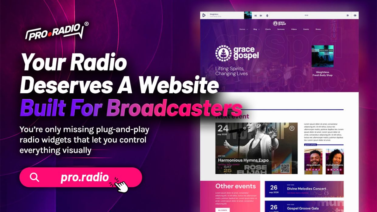
Your Radio Deserves A Website Built For Broadcasters

Generic themes miss crucial radio features; this one is built around your daily workflow. There is a small kindness in software design when a tool understands the work you do. The right radio website does not ask you to bend it into shape. It already knows how a station runs, what a daily workflow looks like, and where the friction usually lives. Pro Radio is a theme built around broadcasters. Before you add more content, promotions, or shows, it is worth asking one simple question: does your website really help people listen? These tips will help you create a radio site that feels easier, faster, and more useful from the first visit. That decision affects every part of the daily experience. What “Built For Broadcasters” Actually Means A theme built for broadcasters does not start from a generic page-and-post structure. […]

trending_flat

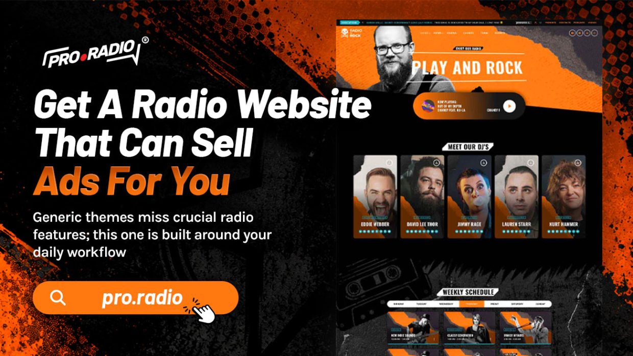
Get A Radio Website That Can Sell Ads For You

Without sponsor-ready layouts, your site can’t justify better ad packages and prices. Selling ads on a radio station should not feel like a second job. It should feel like the station’s own website is doing most of the work. The reality for most stations is the opposite. The owner chases sponsors one by one, sends invoices manually, and answers questions about performance from each advertiser by hand. The bottleneck is rarely the audience. It is the website. A site that sells ads for you is not a fantasy. It is a configuration. These tips will help you start your radio website with a cleaner, more professional experience for your sponsors and your listeners. What “Sells Ads For You” Actually Means A great sponsor-ready website does six things. It shows the station is real and active. It displays existing sponsors in […]

trending_flat

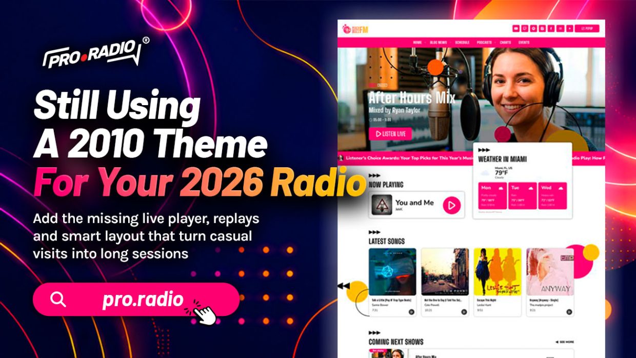
Still Using A 2010 Theme For Your 2026 Radio

Old themes miss today’s essentials: responsive players, podcasts, charts and engagement tools. There is a particular kind of website that screams its age the moment it loads. A narrow layout. A heavy header that takes a few seconds to render. A play button that triggers a separate window. A schedule shaped like a 2010 calendar widget. None of this is your fault. The theme was good in its time. Its time has passed. Modern radio audiences expect a modern site. Want to build your radio website without making things complicated? Here is what that actually means. What A 2010 Theme Cannot Do Themes from the early 2010s were designed for desktop visitors with patience, slow but stable internet, and a willingness to click through multiple pages. None of those assumptions describe today’s listener. Modern visitors are mostly on phones. They […]

trending_flat

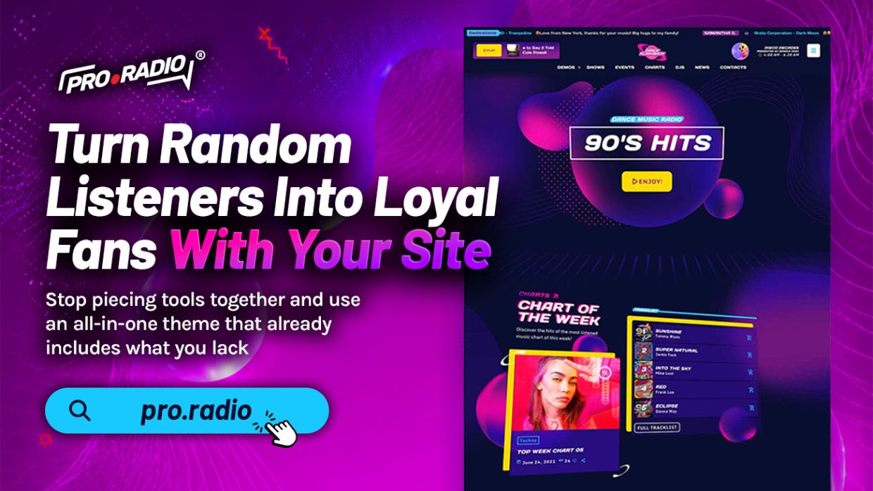
Turn Random Listeners Into Loyal Fans With Your Site

Without these engagement tools, visitors never get a reason to come back to your station. A random click does not become a loyal fan by accident. It happens because the website gives the visitor something to do, something to feel, and something to return to. Most station sites stop at “press play.” The loyal listener is built by what comes after that. If you want to start a radio website that feels less like a static page and more like a real broadcast hub, these improvements are a great place to start. This is about turning a single visit into a habit.  The Path From Random Listener To Regular A new visitor lands on your homepage. They press play. They listen for two or three minutes. What happens next decides whether they ever come back. If the site offers nothing […]

trending_flat

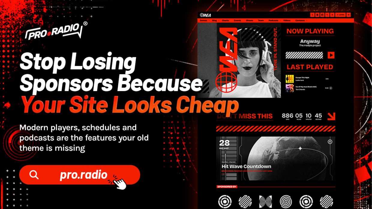
Stop Losing Sponsors Because Your Site Looks Cheap

You’re missing sponsor-ready layouts that actually showcase partners like pros expect. Most station owners know the moment. You finish a sponsor pitch, the conversation is warm, then the prospect quietly visits your website. The energy in the next email is different. The follow-up is colder. The deal shrinks or disappears. The audio did not change. The conversation did not change. The website said something you did not want it to say. Sponsors do not just buy audience. They buy how the station presents that audience. These tips will help you create a radio station website that feels useful, active, and easy to explore. What Sponsors Actually Look For A sponsor evaluating a station looks at three things on the website: does the station look real, does it look active, and does it look organized enough to deliver on what is […]

trending_flat

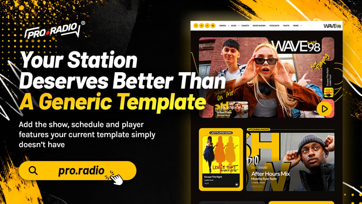
Your Station Deserves Better Than A Generic Template

Generic themes lack the radio-specific features that grow listeners and ad revenue. There is a strange ritual that almost every new radio operator goes through. You scroll through a marketplace of beautiful themes designed for portfolios, magazines, restaurants, and digital agencies. Each promises to be flexible enough for “any business.” You pick one. You spend weeks bending it. The result is a beautiful site that is not really a radio site. A radio station deserves a foundation that already understands what a radio station does. With the right structure, you can start your radio website in a way that supports your brand, your schedule, and your listeners. What A Generic Theme Cannot Do A generic WordPress theme can handle pages, posts, menus, and images. It cannot natively handle live audio, show schedules, presenter profiles, podcast embeds in the radio player, […]

trending_flat

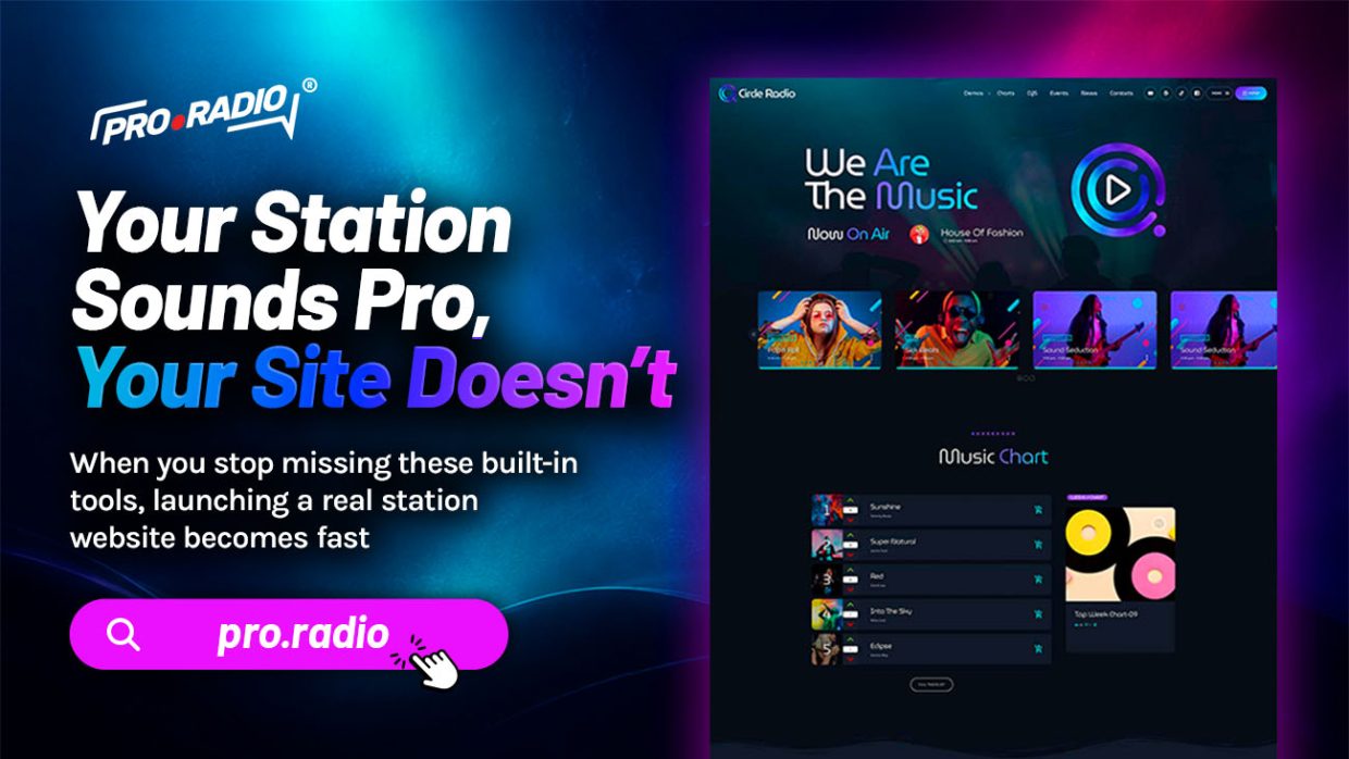
Your Station Sounds Pro, Your Site Doesn’t

Add the missing pro features that finally align your brand on air and online. There is a familiar gap in radio. The studio is dialed in, the hosts are sharp, the playlist flows like it should. Then the website tells a different story. The brand on the air sounds confident. The brand online looks unsure. Want to build your radio website without making things complicated?  This article is about closing that gap with features that actually belong on a radio site. The Brand Mismatch Visitors Feel Instantly When a listener visits your site after hearing the station on air, they bring expectations. Your jingles sound polished, so they expect a polished homepage. Your hosts sound organized, so they expect an organized schedule. Your music is curated, so they expect a “now playing” area that tells them what is on right […]

trending_flat

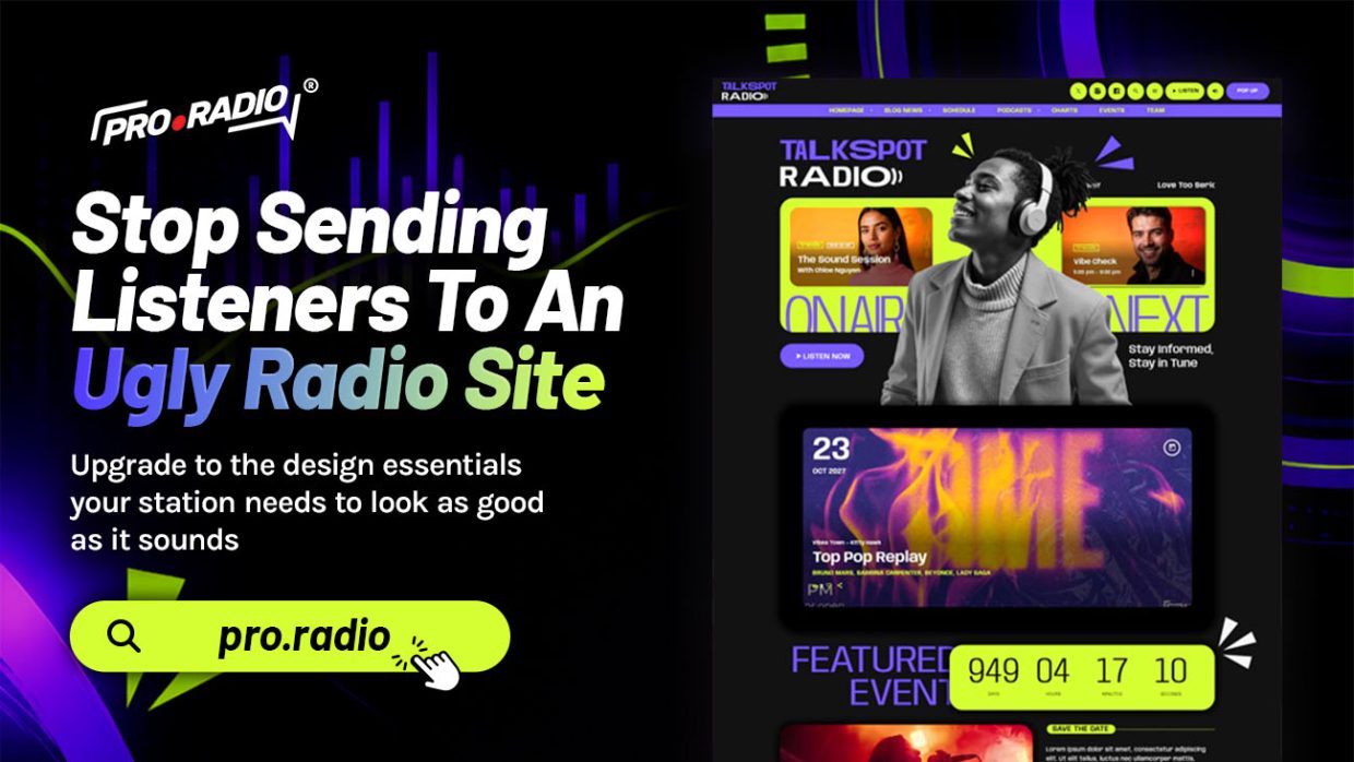
Stop Sending Listeners To An Ugly Radio Site

https://www.youtube.com/watch?v=V30FvrU3Ok4 Upgrade to the design essentials your station needs to look as good as it sounds. You spend hours selecting the right playlist, you polish jingles, you train hosts. Then a listener finds the website and sees a 2012 theme with a tiny logo, an awkward color clash, and a homepage that says “Welcome to our radio.” That mismatch is doing real damage. This is not about chasing trends. It is about looking like the station you already are. The Visual Gap Between Your Sound And Your Site There is a strange habit in broadcasting. Stations care deeply about audio quality, then accept a website that looks like a free WordPress blog template from a decade ago. The result is a visual gap. Visitors hear something professional, then look at something amateur. They feel a small confusion, then look for […]

trending_flat

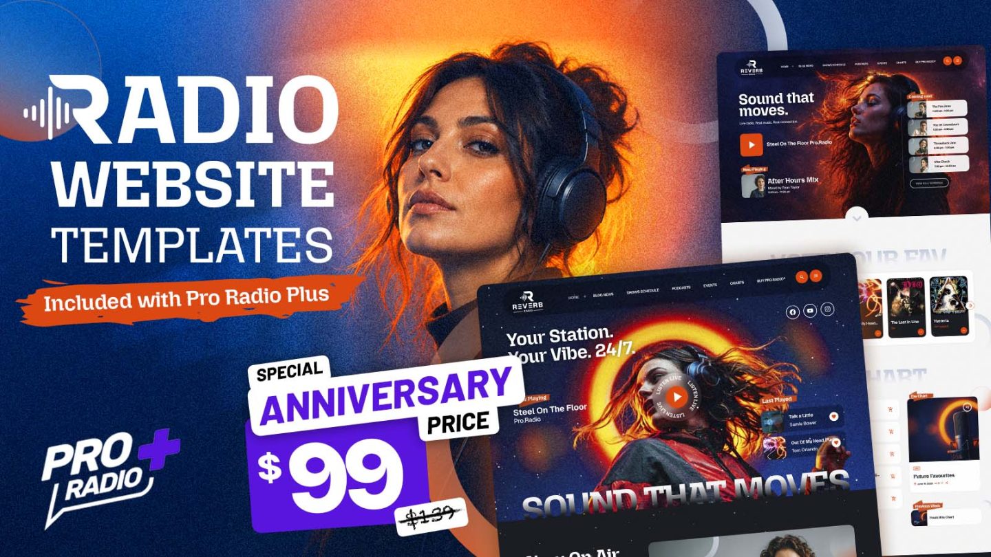
New Exclusive Templates for Pro Radio Plus: Build a Radio Website That Feels Alive

Your radio website should not feel like an empty page waiting for you to figure everything out. When you are building a station online, there are already enough things to manage: the stream, the schedule, the shows, the presenters, the music, the podcasts, the events, the content, and probably ten other things that were supposed to be “quick” but somehow took the whole afternoon. That is why good templates matter. A strong radio website template gives you a real starting point. Not a blank canvas. Not a generic business layout with a play button added at the end. A real radio-focused design that already understands what a station needs: live listening, on-air shows, schedules, charts, events, podcasts, news, and ways to keep people engaged. And now, Pro Radio Plus users get access to a new exclusive pack of templates, available […]

trending_flat

Your Radio Website Is Leaking Listeners

https://www.youtube.com/watch?v=G9EEyxavNAM Because it’s missing these simple features that keep visitors listening instead of leaving. You may not see them go. You only see the numbers slowly fail to grow, the average session time stuck at twenty seconds, and the same handful of loyal fans showing up week after week. Meanwhile, the music is good, the shows are real, the team puts in the hours. So what is leaking? In most cases, it is not the audio. It is the website around it. The Quiet Way Radio Websites Lose People A listener types your station name. They land on your homepage. They want one thing: to press play and hear what is on right now. If they have to scroll, search, squint at a tiny play button, or wait for the page to finish loading, you have a small window before […]

AD

Login to enjoy full advantages

Please login or subscribe to continue.

Go Premium!

Enjoy the full advantage of the premium access.

Stop following

Unfollow Cancel

Cancel subscription

Are you sure you want to cancel your subscription? You will lose your Premium access and stored playlists.

Go back Confirm cancellation