Free Halloween Radio Station Templates — Comic Social Pack + AI Kit
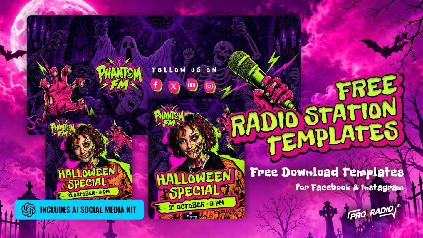
Halloween is the perfect excuse to make your radio station look louder, darker and a lot more fun. Maybe you are preparing a Halloween special. Maybe you have a DJ session, a spooky playlist, a late-night show, a podcast episode or a one-night broadcast on October 31st. The problem? You need visuals for Facebook, Instagram, headers and promos, and you probably do not want to spend the whole afternoon designing everything from zero. That is why we created this new free Halloween radio station templates pack. 👉Download the free Halloween radio station templates A Halloween visual style made for radio stations It is a bold comic-style social media pack made for radio stations, DJs, podcasters and online broadcasters who want their Halloween campaign to stand out immediately. Bright magenta. Acid green. Horror comic textures. Monster hands. Microphones. Loud typography. A […]