The "post carousel" widget of Elementor is added by the Pro.Radio Elementor plugin and is useful to display blog posts or other custom post types in a carousel (slider with 1 to 6 elements per row in a vertical design). The design can change depending on the chosen post type.
This item can be adapted to any column width, using the appropriate parameters.
How to add a "Post Carousel" widget
Step 1: Edit your page with Elementor
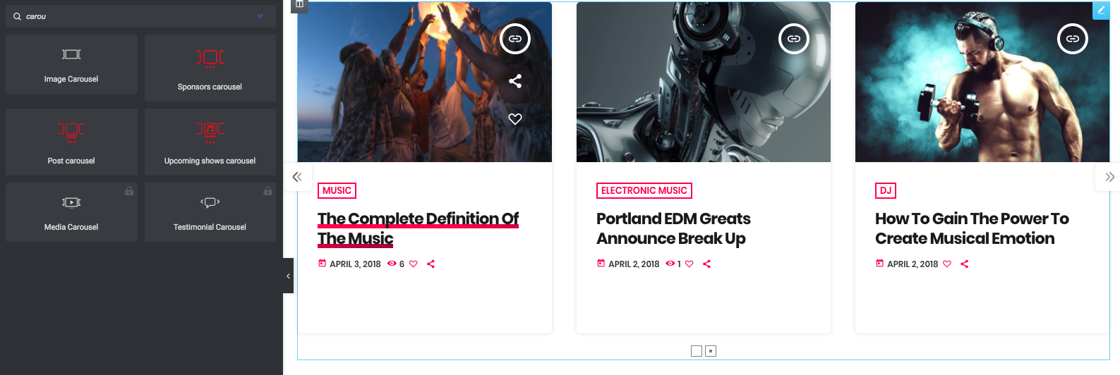
Step 2: search "carousel" in the widgets
Step 3: Drag in your page the "Post carousel" element.
This widget has 2 groups of settings: design and query.
If you plan on using a custom post type, you may want to set the Query parameters first.
Step 4: Open the Query and set the desired post type from the dropdown
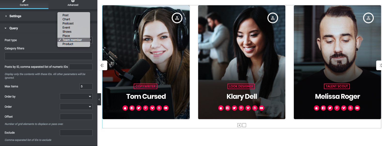
This parameter is limited to the post types added by the theme (you can't use other post types added by third party plugins).
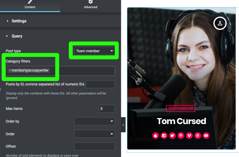
Step 5: Category filters - filter the results by the custom taxonomy associated with your chosen post type (more info are available in the documentation of each post type).
Step 6: Posts by ID - set a list of IDS separated by a comma. If used, any other parameter will be ignored. Example:
128,234,934
Step 7: "Max Items" - limit the total results. You should keep this number within reasonable amounts (like max 9 or 12 ) to avoid excessive loading times.
Attention: if the total amount of items is less than 3 and you enable, in the Settings tab, the Loop parameter, the existing items will be duplicated to produce the loop.
Step 8: "Order by" - Read more in the paragraph "Ordering Widget Results" within the page "4.2 - Elementor pages".
Step 9: "Exclude" - you can remove from the output certain items by adding their IDs in this field, comma-separated like this:
128,234,934
Design parameters
Step 1: Open the Settings tab
Step 2: set the "items per row" depending on the width of your column, both for Desktop and tablet. You can use the Responsivity switcher from Elementor to verify the results across multiple screen sizes.
This element is meant to display the items with an average width of 370px. You should display 3 items per row if the screen width is 1200px or above, or 4 items if you use a full width section.
If you use it in a 2/3 colum, set the items to 2 per row.
If placed in a 1/3rd row, set it to 1.
Step 3: spacing settings (gap, padding) you can set them according to your website design. You can also set gap, padding and border radius to 0 to achieve a full screen slider
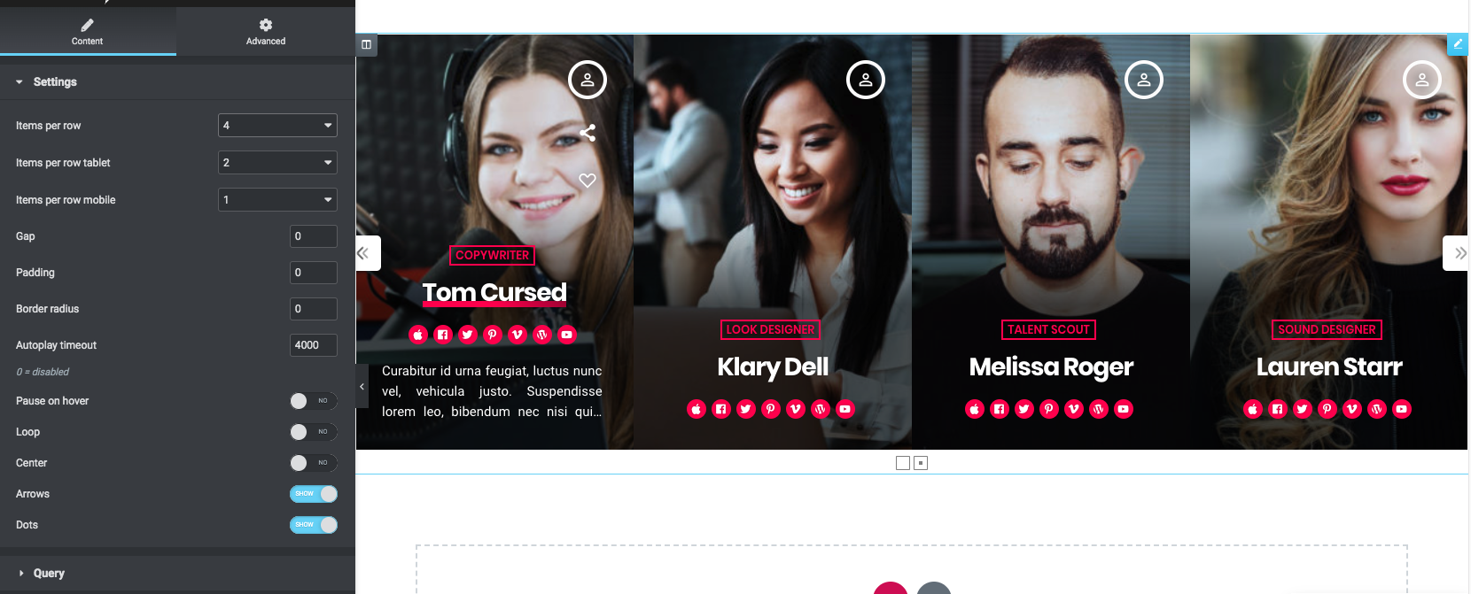
Step 4: Autoplay timeout - this value in milliseconds is the pause before the next slider animation. You can set this to 0 to disable the animateion (the carousel never slider).
Step 5: Pause on hover - keep it still when hovering the carousel with the mouse (or touching it with a touch device)
Step 6: Loop - if enabled, you can scroll endlessly toward any direction. If the total number of items is less then 3, the existing items will be repeated to fit the "columns" quantity.
Step 7: Arrows and dots - show or hide those elements. The carousel can still be dragged.


